Much like a well-considered mix-tape or carefully curated best-of album, here is a selection of various projects made for Vega School of Brand Leadership in Cape Town, South Africa. Made between April 2012 and November 2018, most of these projects were created for a number of internally planned events, including Showcase, Fresh Cream, and Brand Challenge.
One project, “When Worlds Collide”, was created for an external integrated campaign, meant to attract new students and generate awareness around the school’s offering and products. These projects would have included digital touchpoints, such as websites, emailers, and social media, which have long since been taken down, so only the print executions can be shown here.
Year
2012 – 2018
Scope
- Collateral
- Apparel
- Direct Mail
- Web Design
- Social Media
Technology & Tools
- Adobe Illustrator
- Adobe Photoshop
- Adobe InDesign
- Mailchimp
- Squarespace
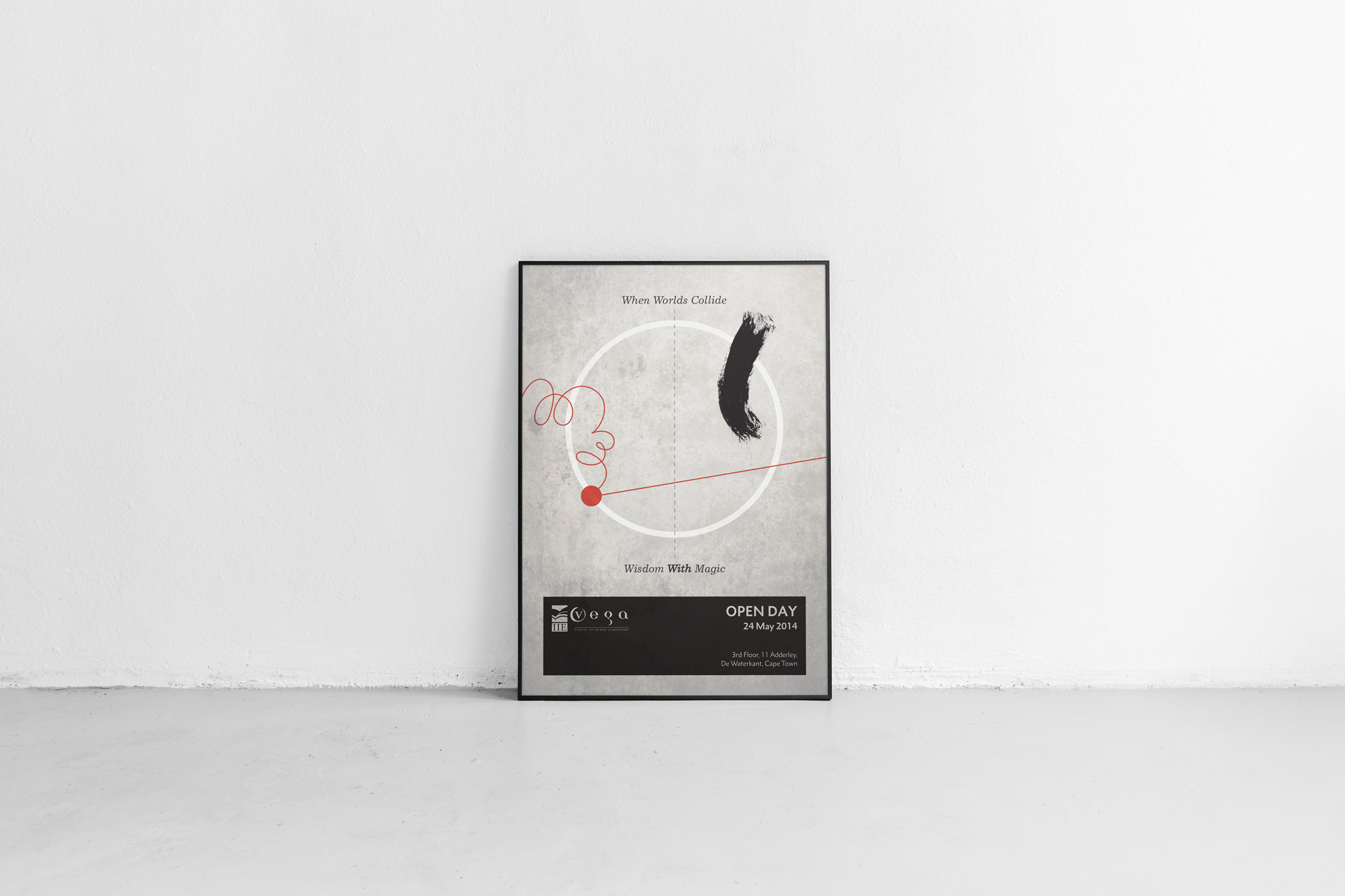
When worlds collide campaign.
When Worlds Collide is an integrated campaign designed for Vega in 2014. The concept was based on particle acceleration, telling the story of when one world (strategy) and another world (creativity) collide. The result, wisdom with magic. The art direction was inspired by Abstract Expressionism, especially the work of Franz Kline and Mark Rothko, merged with visuals from supercollider imagery used in particle physics. A poster and three fact sheets (one for each featured course) were the only executions for the campaign before the project was canceled for being too alienating to the target audience.


Showcase: an annual graduate exhibition.
At the end of every year, Vega holds an exhibition, which was an industry-wide calendar event, showcasing the collected work for all graduate students from all major departments, including Brand Strategy, Brand Management, Visual Communication, Copywriting, and Multimedia Design (Digital Design). Gilgamesh designed all the campaigns for Vega Cape Town’s Showcases between 2012 and 2018.
Occupy – Showcase 2012.
Occupy was the theme for Showcase 2012, fuelled by the influence of the Occupy movement, which was very popular at the time. Following the first Occupy Wall Street event, the revolutionary and activist spirit of the Occupy movement was embraced here with expressive, grungy, verve.


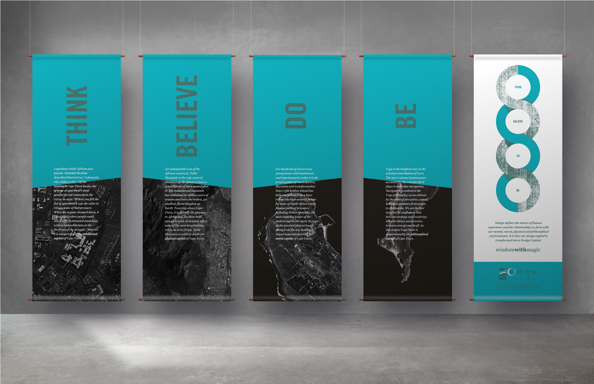
Design Capital / Capital Design – Showcase 2013.
Capital Design/Design Capital was the theme for Showcase 2013, describing the idea of human capital, mixed with the fact that Cape Town was preparing to be the World Design Capital in 2014.

Crushed Ore / Hidden Gold – Showcase 2014.
Crushed Ore / Hidden Gold was the theme for Showcase 2014, communicating the idea that no idea is a bad idea. One writes an idea on a piece of paper, and you think it’s stupid, and you proceed to crumple it up and throw it in the bin. We can all relate to a session of burning the midnight oil, with a bin filled with crumpled pieces of paper, all rejected ideas. Oftentimes, it’s that first piece of crumpled paper that is pure gold.


Obsidian – Showcase 2015.
Obsidian was the theme for Showcase 2015, based on the idea that truly creative work is usually the result of massive contrasts in extreme heat and pressure, much like the inner works of an active volcano. Obsidian is a naturally occurring volcanic glass formed when lava extruded from a volcano cools rapidly with minimal crystal growth. It seemed natural to use obsidian as an analogy for creativity in this respect.


Gen-V – Showcase 2016.
Gen-V, meant to describe the literal idea of ‘generation Vega’ (conceptualised by corporate management), was the theme for Showcase 2016. With many restrictions placed by the brief, and given the fact that there was no real core concept to the campaign, layout and typography were stripped to bare bones, Swiss-style, and visuals of student work were thrown on various spreads to add some creative grit.


Converge – Showcase 2017.
Converge was the theme for Showcase 2017, deconstructing notions in physics, including colour relations juxtaposed with converging points in time and space. This was used as a metaphor for the creative process, and the collaboration of strategy and creativity. It’s not a matter of black-and-white thinking, there are so many nuances and subtle gradients that eventually lead to a resolute point for great creative work.


Distort – Showcase 2018.
Distort was the theme for Showcase 2018, and it focused on the manner in which creativity functions in a “post-truth” world, where there is a cognitive dissonance between what is real and what is hyperreal, what is a fact, and what is opinion. All distorted and warped, creativity has an even greater responsibility today to communicate important values such as empathy and human truth. Perhaps a new enlightenment era is required, hence the use of distorted and glitchy Renaissance imagery.


Brand Challenge certificate.
For about five weeks each year, Vega used to transform itself from a school into a fully-functioning advertising agency. Called ‘Brand Challenge’, this pop-up ad agency incorporated all students from 2nd and 3rd-year level into teams of strategists, copywriters, digital designers, graphic designers, art directors, account managers, and the like. Real clients would deliver live briefs to these teams with the intent to actually execute and implement whatever solutions students would present. This gave students a very real insight into what it would be like to work in industry settings, adding serious depth to their education. At the end of Brand Challenge, an awards ceremony would be held to celebrate the best work, and the certificate shown here was designed for students as a token of their proverbial blood, sweat, and tears.

Fresh Cream: an annual awards ceremony.
Fresh Cream was an annual event that celebrated the best work from each department and year of study at the school. Posters and certificates were designed for the ceremony, which was seen as a prestigious event by students and lecturers alike. The winning works would be presented to the school, allowing all students to know what their peers in other departments were doing, keeping standards high, and creating a strong sense of community.
Fresh Cream certificate.
This was the final design for the Fresh Cream Certificate for the Cape Town campus. The theme here tries to convey the two worlds that make the school what it is, creativity and strategy. The juxtaposition of serif and sans-serif fonts, clean and textured surfaces, attempts to emphasise the unique dynamic between strategic creativity and creative strategy at the school.

Pristine – Fresh Cream 2014.
This poster was designed to promote the awards ceremony for Fresh Cream 2014. The theme here surrounds the notion of creative work that can reach the plateau of pristine work. The point is that this doesn’t happen easily, it takes true grit, overcoming many failures, challenging one’s limits, and breaking the boundaries. Hence, the use of hyperbole and oxymoron as a visual language using grayscale photography, juxtaposed with the comparatively quiet layout and use of red typography, which was applied with a spot UV. Photography communicated the challenges and failures that lead to victory.


The Classic Hits – Fresh Cream 2013.
This poster was designed to promote the awards ceremony for Fresh Cream 2013, an annual event that celebrates the best work from each department and year of study at the school. The theme here describes the notion of a classic hits music compilation, using the classical ancient Greek figure of Venus de Milo to accentuate the point.

Specialities